Guidelines logo
This guide contains the general guidelines for the use and placement of the Bancontact logo. These concise guidelines only apply to the logo. Comprehensive brand guidelines are available upon request via info@bancontact.com.
Logo elements
The Bancontact logo consists of two elements:
1. A stylized cardholder-merchant handshake
2. The wordmark 'Bancontact'
Two logos can be built with these two elements: the 'Original' logo and the 'Horizontal' logo. The composition of these logos is predetermined and can not be adjusted. Both logos feature a fixed white rounded rectangle in the background, which ensures consistent readability and viewing. This rectangle also specifies the minimum required white space for the figurative mark and the word mark. In addition, free buffer space surrounding the logo must also be respected.
When the logo is shown against a coloured background or on top of an image, the white rectangle becomes visible. However, when the logo is placed on a white surface, it blends with the background.
Logo: 'Original'

Logo: 'Horizontal'

Logo choice
The choice of form of the logo is done in function of the carrier, the available space and readability. When both logos are applicable and adequate, preference is always given to the 'Original' logo.
Full colour
The Bancontact logo must always be used with the correct colour values. Strictly determined RGB colours are to be used for websites and all other 'on screen' applications.

White space & minimal size
The requirements for minimal space surrounding the logo should be respected at all times.
When the logo is placed against a white background, the white logo rectangle provides the minimal required white space between the word and figurative mark. For coloured backgrounds, this white space should be tripled.
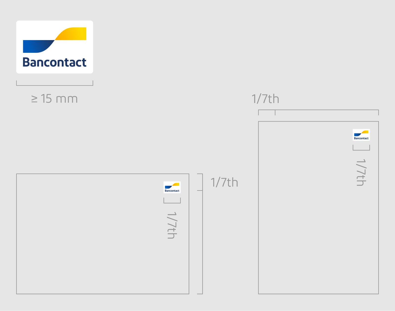
Logo: 'Original'
For print purposes, the 'Original' version should have a minimum width of 15 mm. For screen applications, the minimum width is 50 pixels.
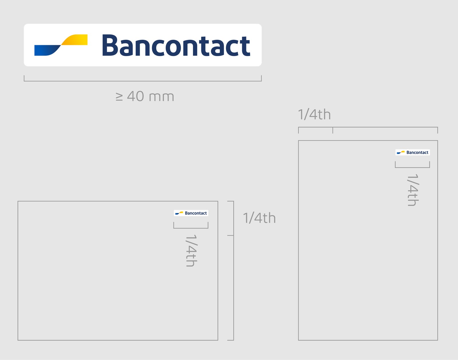
Logo: 'Horizontal'
For print purposes, the 'Horizontal' version should have a minimum width of 40 mm. For screen applications, the minimum width is 115 pixels.
Logo use by third parties
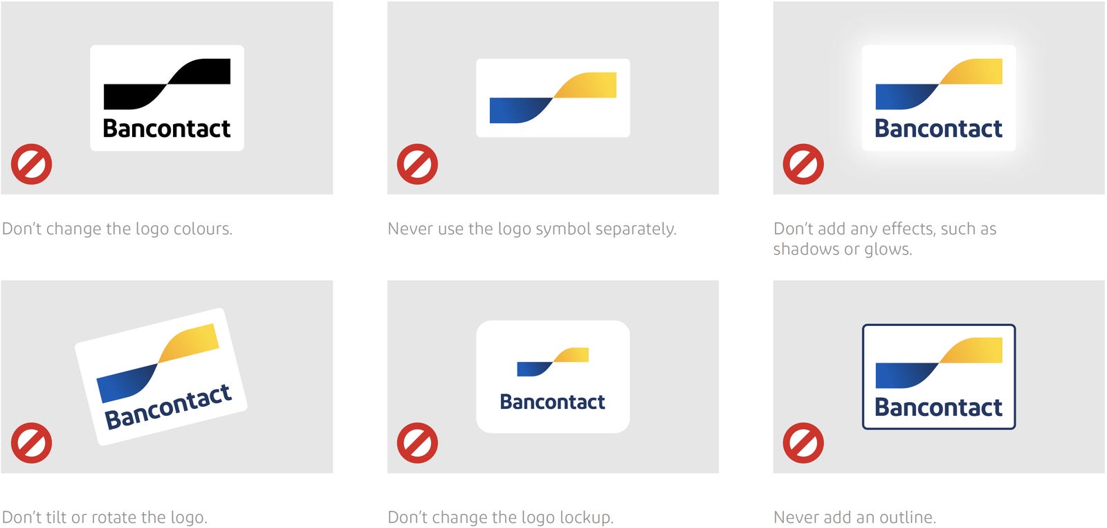
The Bancontact logo should always be displayed ‘as is’ and upright. Do not add shadowing, lines, glows or reflections. Do not change the colours or proportions.
Background: for layout purposes, it is allowed to show the logo against a coloured background or on top of an image, as long as the logo itself is not changed and no items are added.
These guidelines apply for both the 'Original' logo and the 'Horizontal' logo.
Brand name
When the name Bancontact is used in your communications, it must always be written correctly. The brand name always starts with a capital B, and can not be split. The brand name is the same in all languages.
